
Problems:
• Old UI was difficult to understand
• Difficult to discern workflow
• Unnecessary and redundant functionalities
• Style was stilted and cold
Goals
• Present the modules in an organized workflow
• Implement hierarchy by focusing on key actions and removing redundancy
• Build with future implementations in mind allowing the product to grow
• Include live stats that impart quick information at a glance
• Give SPHEREboard a more human feel and user friendly style
When I first encountered at SPHEREboard, I found myself at a loss as to where to begin. Their home page offered little direction with their stacked cards adorned with cryptic icons. Upon multiple user interviews, I learned that my experience was not uncommon.
Strong feeling of the Hieroglyphic Effect. What do these pictograms mean?
More hieroglyphs!
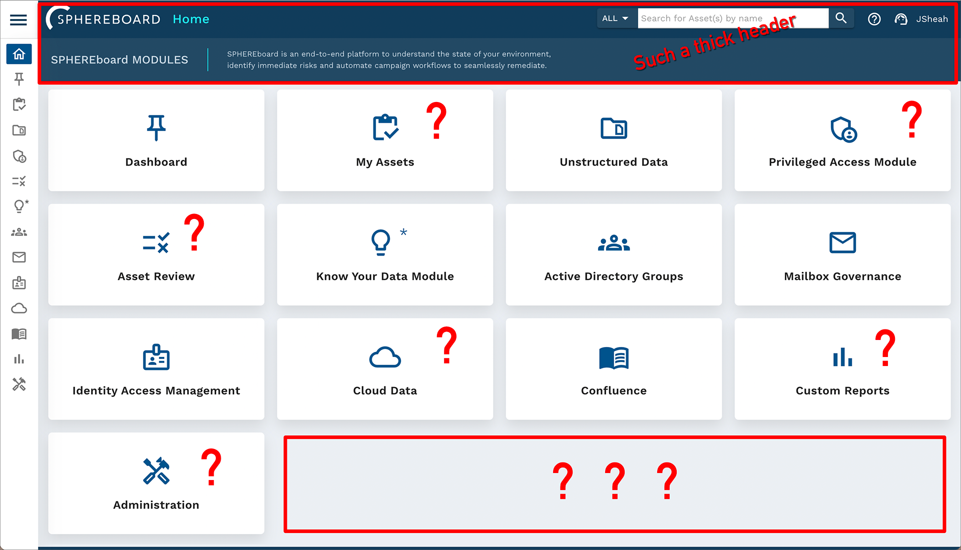
Their main page for admin resources also followed a similar vein with no direction, too many icons, and awkward layout.
In addition, the icons differed in style from the icons on the home page as well as the side nav menu.
We began our research by conducting focus groups with all teams – Sales, Engineering, Service, and Product.
Together we decided on a cohesive direction for the product to help eliminate the aspects that didn't align and design new elements that affirmed this new direction.
• Condense and reduce the number of modules
• Present modules in an order based on workflow
• Minimize icon use to maintain clarity
Below is a sample screenshot of the sales strategy and subsequent sketches of possible layouts.
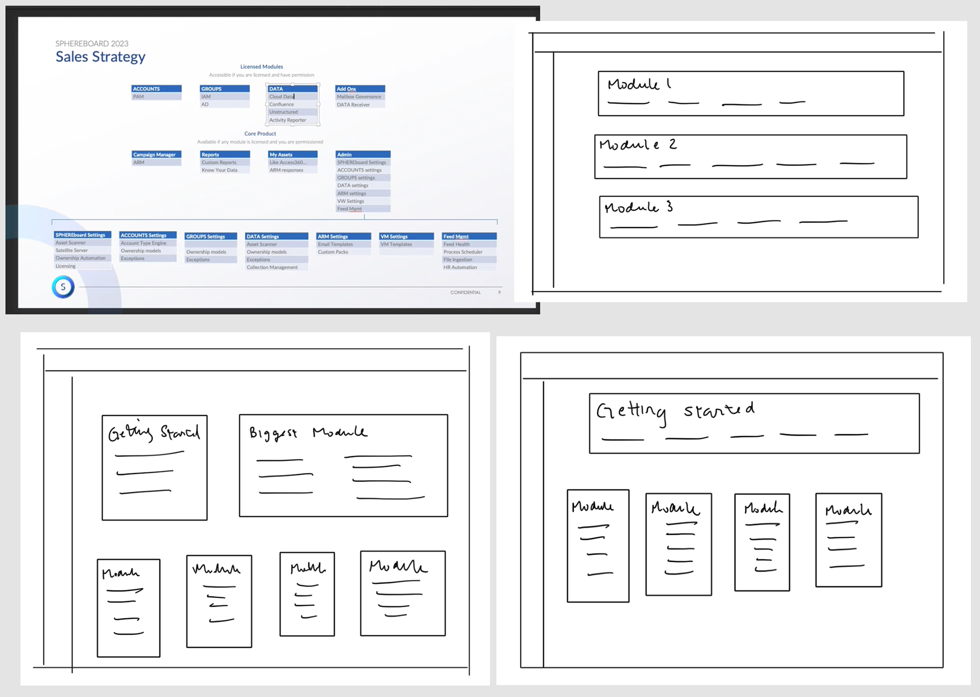
I also conducted field studies and usability tests with select members of our Engineering and Service team using interactive prototypes and follow up interviews. My priority as a designer is to build with the intended user in mind. While flashy elements may entice Sales, if the form doesn't function in a useful way for the engineers and customers, then it becomes clutter.
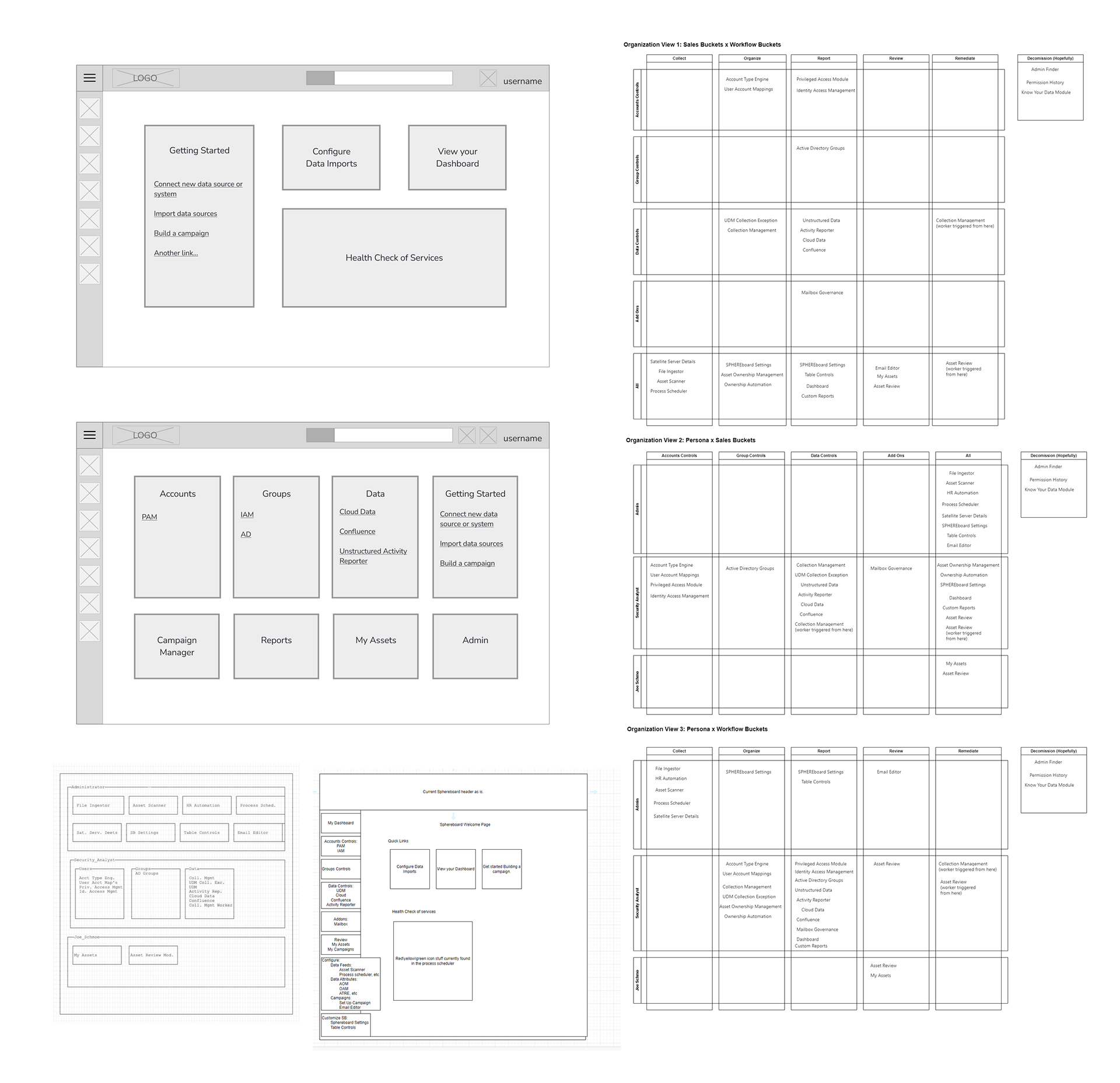
Working closely with product owners, the wireframes grew clearer and clearer as we figured out which components went together to form modules and how each module flowed into the next.
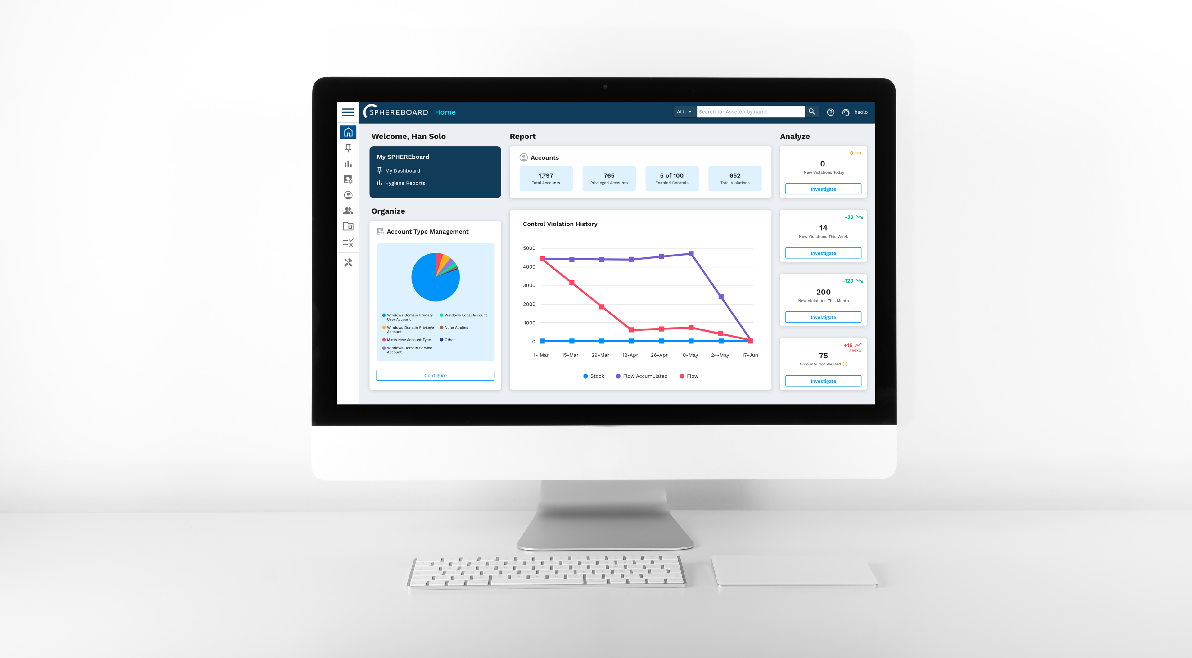
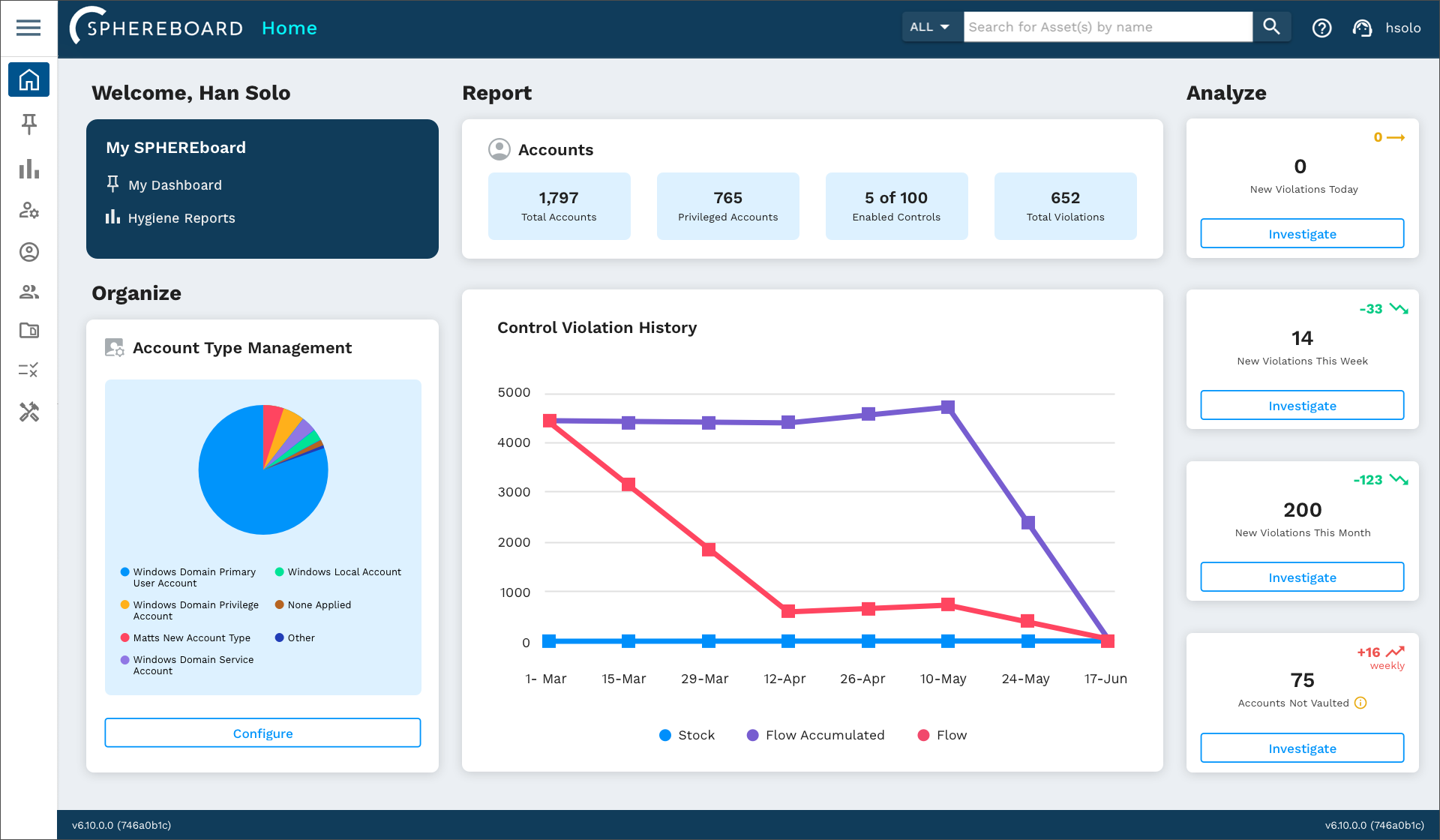
At this point, the product owners decided the home page would be called the Hygiene Hub and needed to showcase an efficient pulse check for users as well as present an organized breakdown of the product.
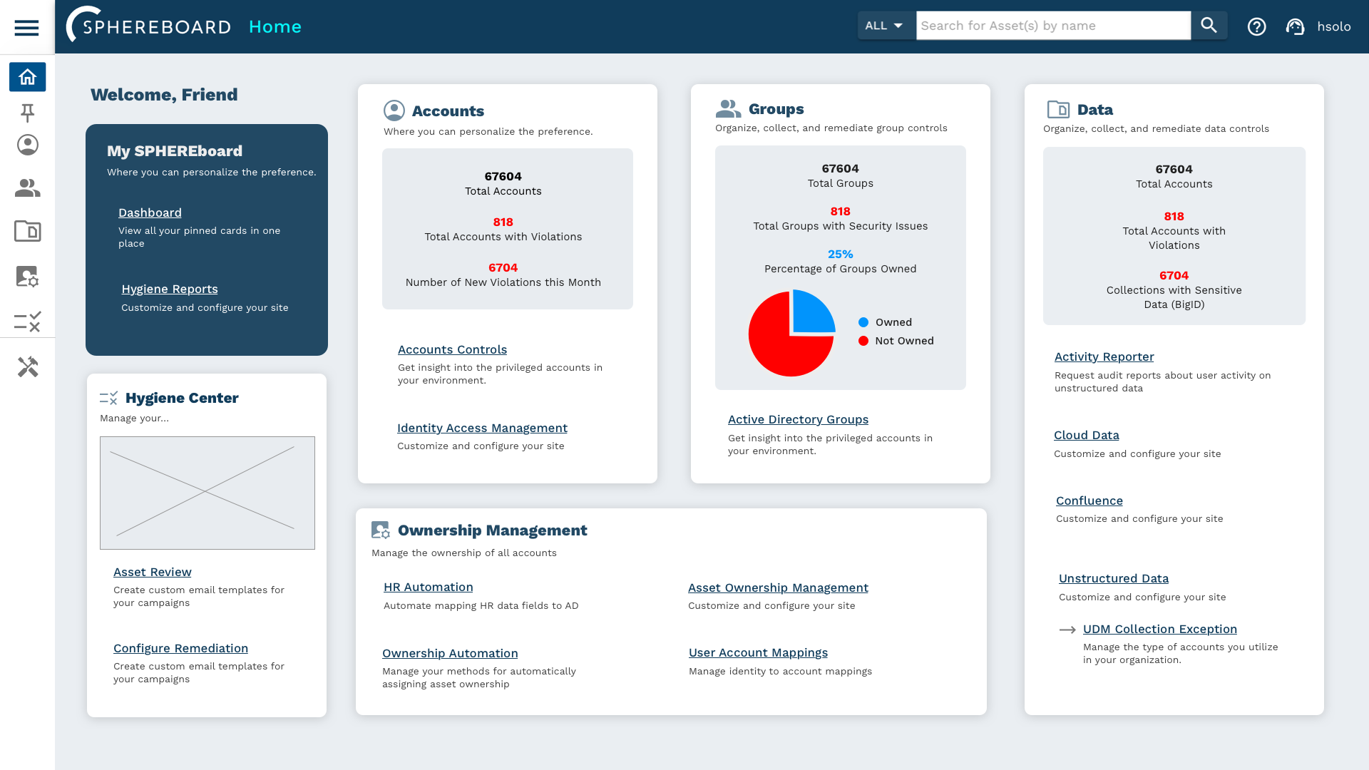
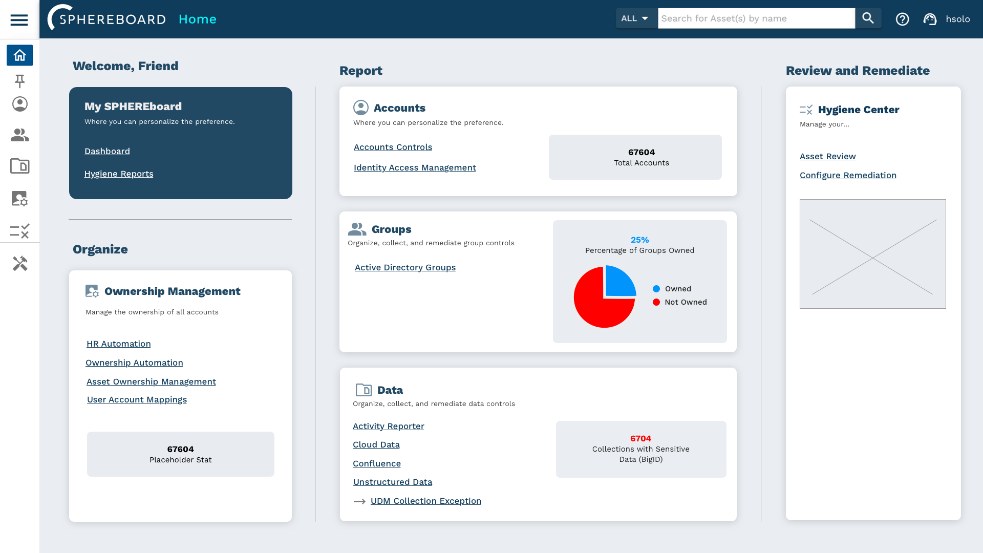
After many rounds of designs and prototypes, we finally landed on a cohesive and functional Hygiene Hub that gave that human touch that the product originally lacked.
The new Hygiene Hub proved to be both functional and understandable with the new organization of modules and incorporation of live stats.
We agreed that the general user's workflow would consist of Organizing, Reporting, Reviewing, and Remediating. In addition, we also presented the information in a human centered way with rounded cards, soft colors, and a welcome greeting.
Customers also gave positive feedback about the new look. The Service team reported a significant decrease in calls regarding navigation.
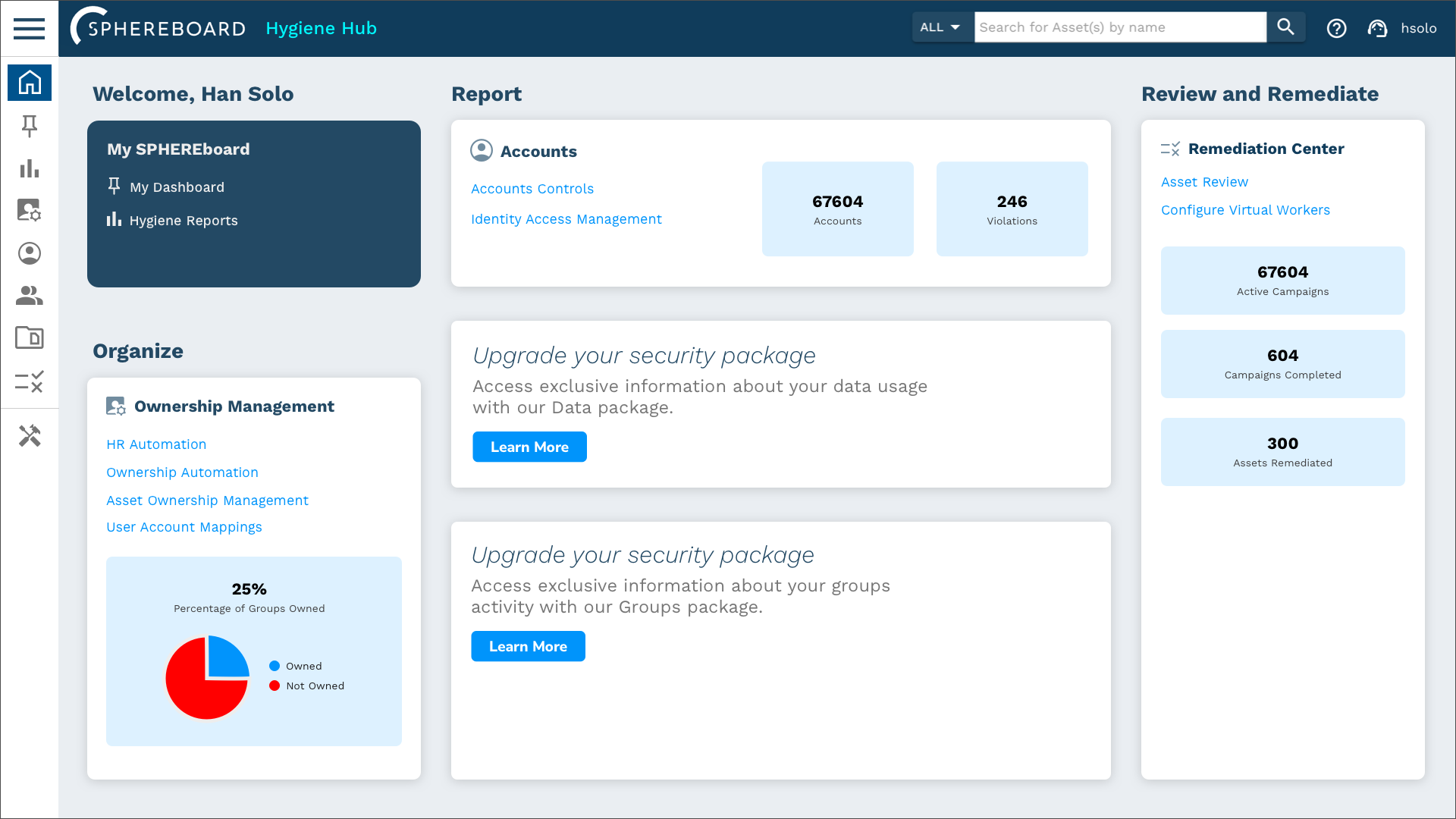
This design also included the flexibility to accommodate our tiered packages. If customers did not purchase the full service package and only opted for certain modules, the cards would reflect a lack of data and also a soft suggestion to reach out to a representative to make an upgrade.
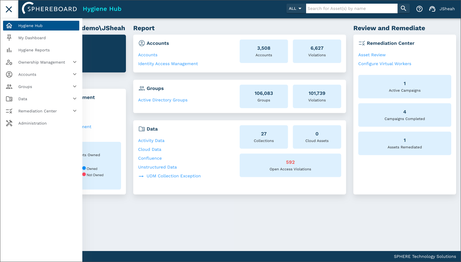
The side navigation menu also updated to reflect the newly organized modules. Reducing the number of icons greatly improved the readability of the menu and gave more clarity to the inner workings of the product.
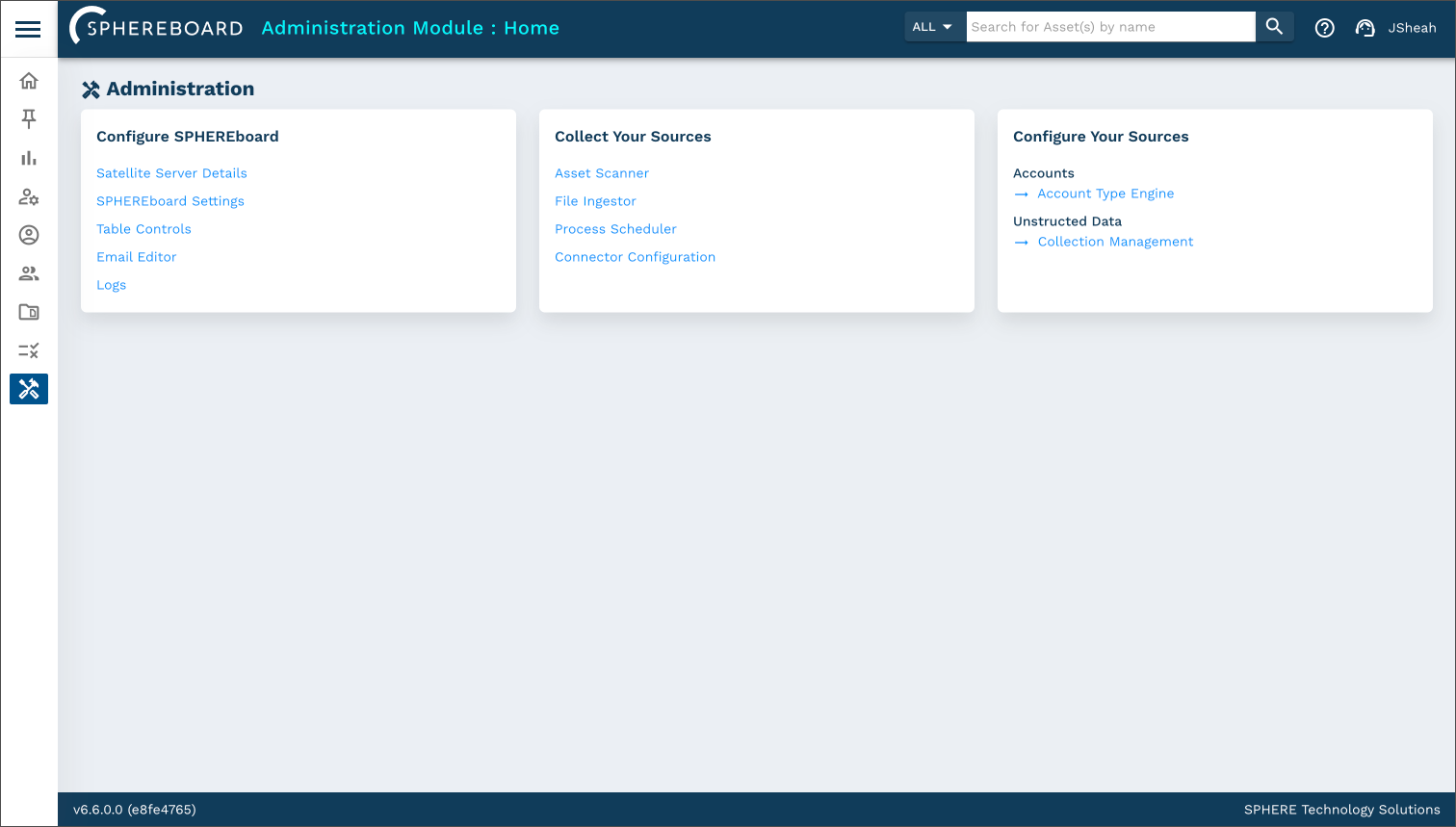
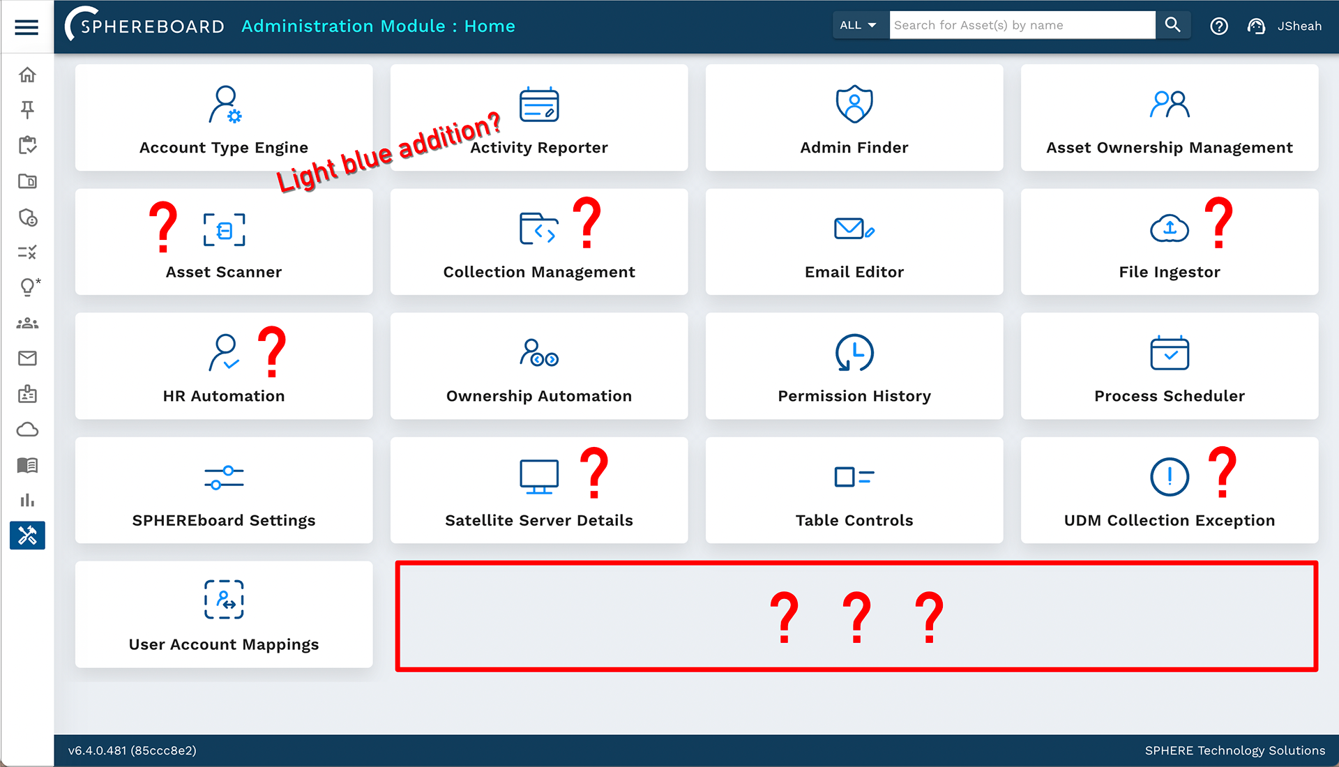
The Administration page also updated to reflect a breakdown of admin tools and resources. The order of the admin modules also coincide with the workflow of a user with admin privileges.
In addition to the Hygiene Hub and Admin pages, I polished off the product with updated designs to its lesser features, such as the SaaS login page, to fully adhere to the product's new direction.
The old page looked dated, lacked any human qualities, and the login button hid suspiciously in the top right corner in a lackluster grey shade.

I made sure that the new login page emitted a strong human centered design with clear and understandable directions to enter credentials. Overall, I feel that this page is a perfect introduction to a clean and modern product that puts the human before the machine. Customer calls regarding login process also decreased upon launch of this new design.

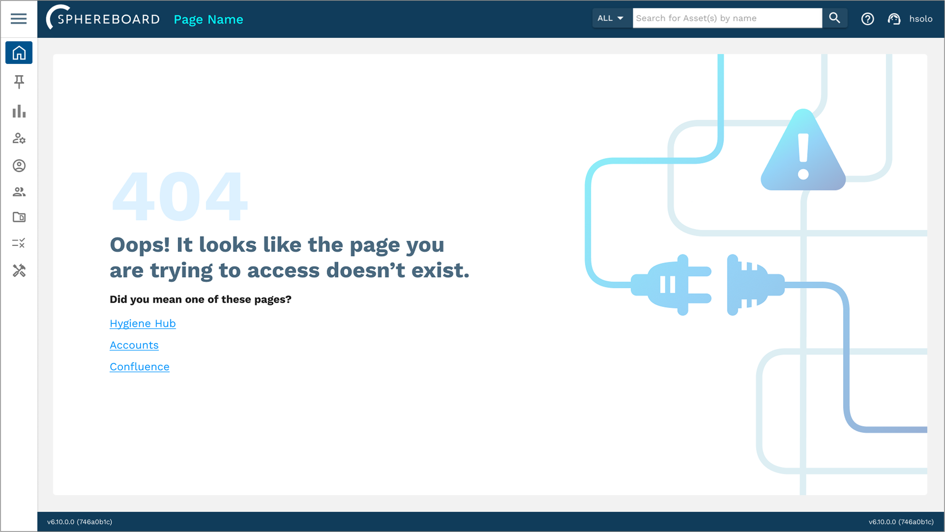
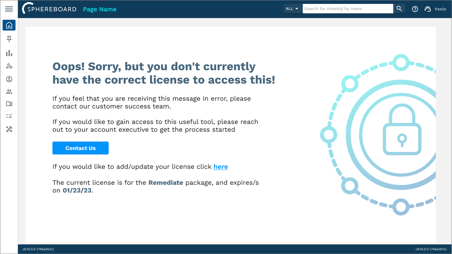
I also updated the standard 404 page and Expired License page with a more modern and slightly playful feel that fit more with SPHEREboard's new style.
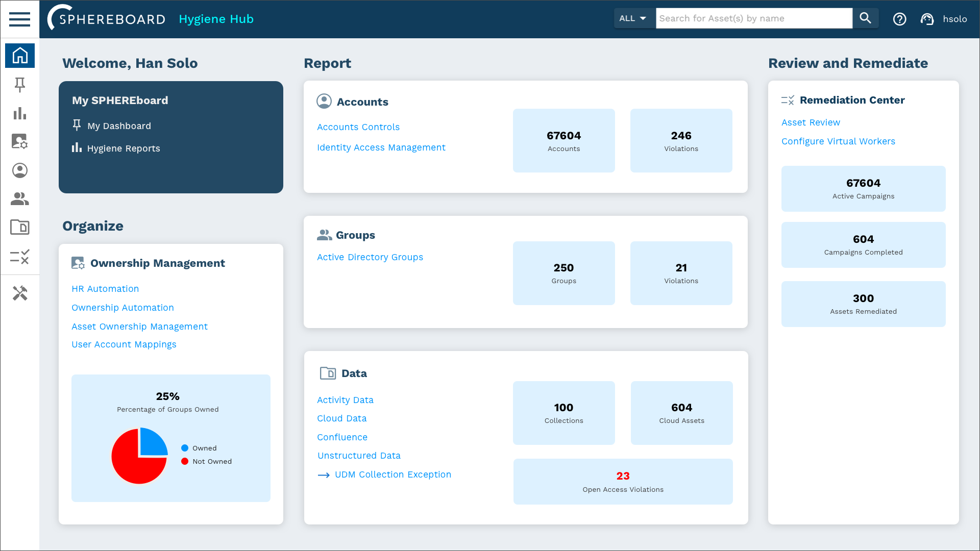
Over time I continued to update and improve different parts of SPHEREboard, and eventually we reached a new package for customers.
As an alternative to the Hygiene Hub, we unveiled the Intelligent Discovery page.
As an alternative to the Hygiene Hub, we unveiled the Intelligent Discovery page.
This new page showcases even more data at a glance and offers a set of Analyze cards that show trends and give alerts when the analysis yields concerning results.
As I continue my role as UX/UI Designer for SPHEREboard, I am proud of how far the product has come from a design standpoint as well as a usability standpoint as it continues to grow and evolve. I am excited to see what the future has in store.