
Problems:
• Old system was convoluted and inefficient
• Over 25 years without update
• Users requiring up to 5 screens
Goals
• Reduce the amount of screen real estate
• Implement hierarchy by focusing on key actions and removing redundancy
• Build an internal tool that adheres to AAFMAA's current brand
When the client proposed the project to me, they specifically noted that they wanted a "well-organized, efficient, streamlined, easy to use, easy to learn, powerful system." During research, we took inspiration from similar systems such as
• Oracle
• Agencybloc
• Basys
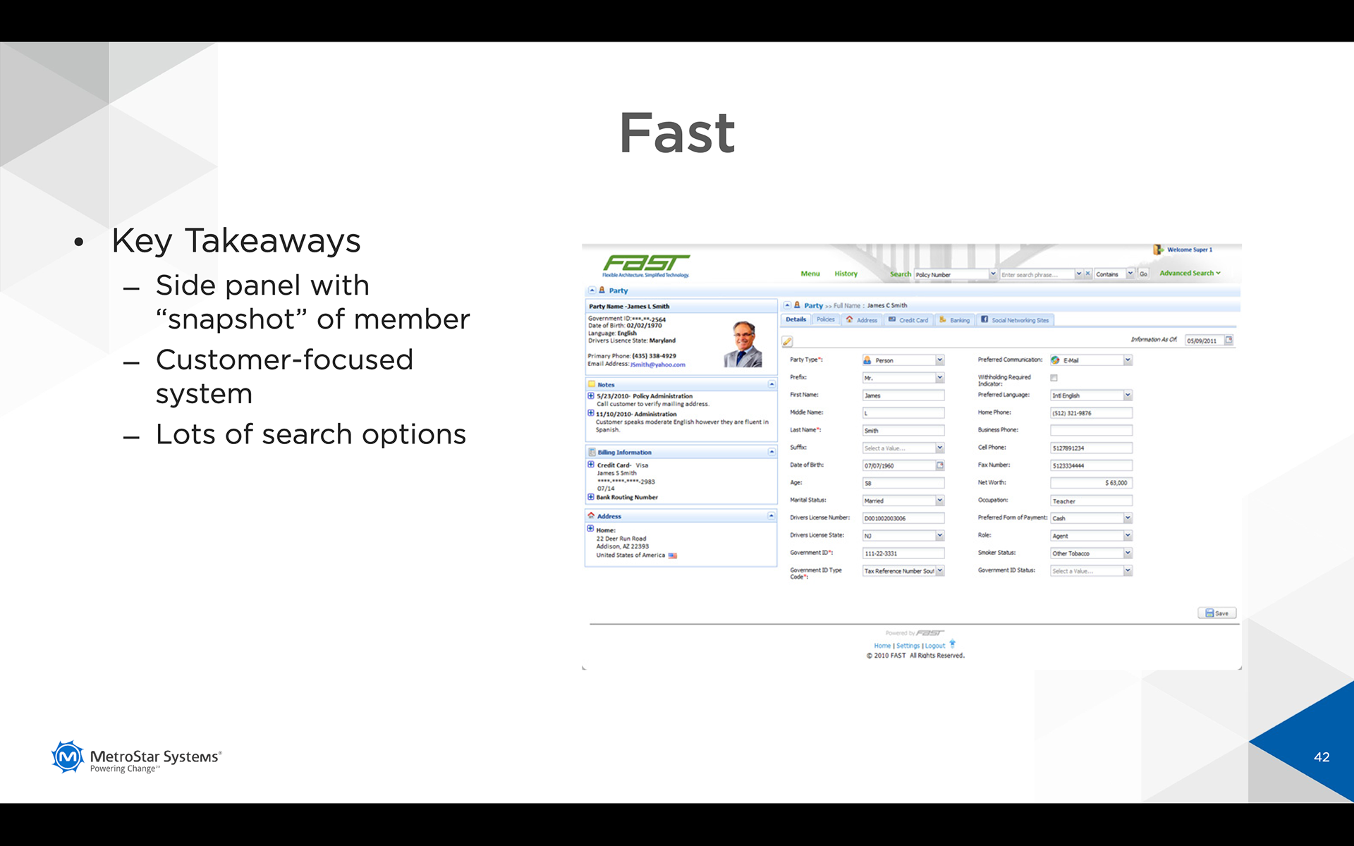
• Fast
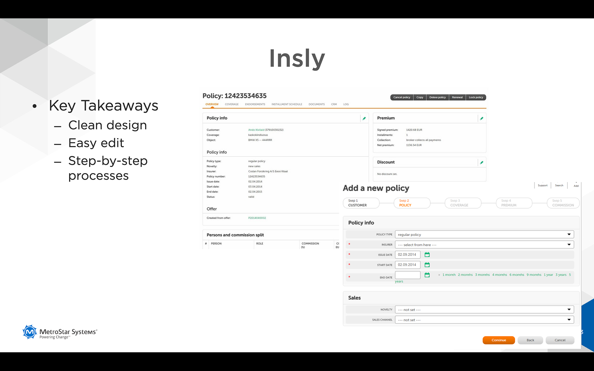
• Insly

We sought to build a tool that included
• More flexibility
• Allowance for easier assignment of products & services
• Better organization of information
• Better mental model of customer
• Improved customer relationship
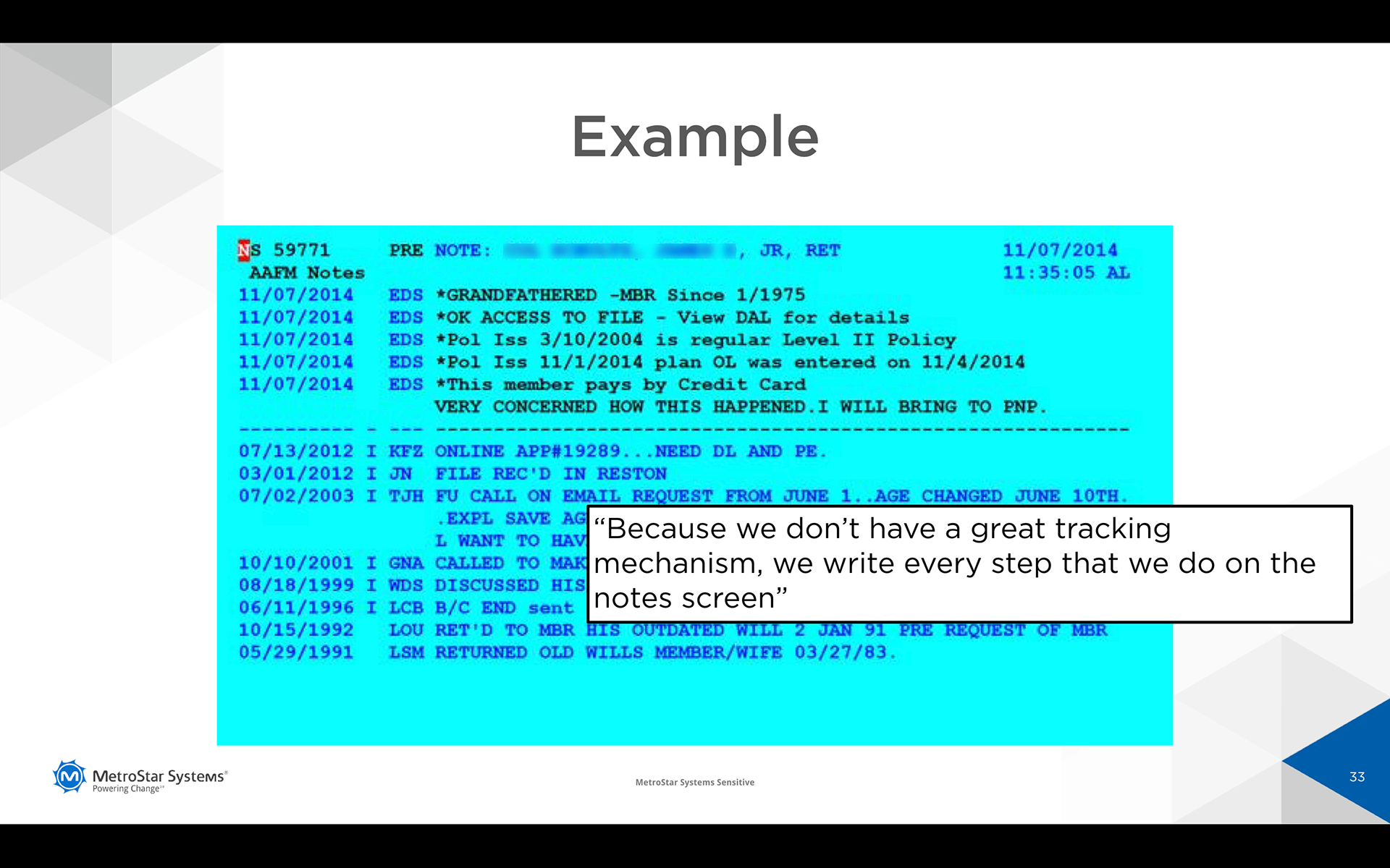
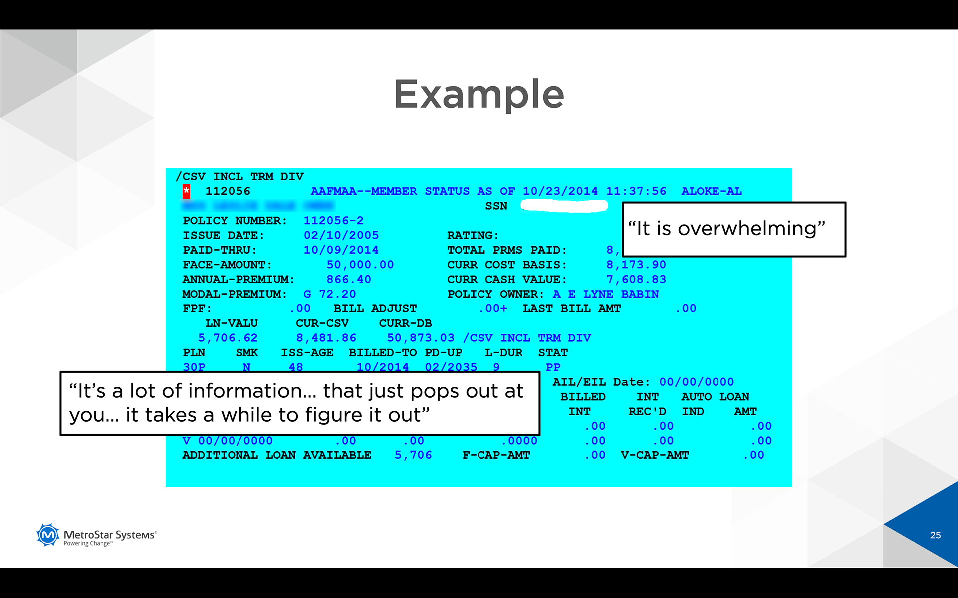
Below is a sample screenshot of a user's typical screen on a regular workday.
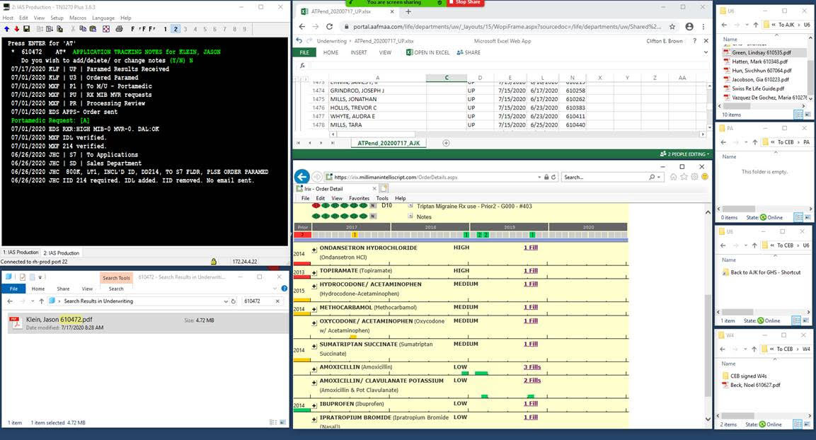
I job-shadowed a user to get a feel of her workflow and priority of needs. I noted that the screens were typically filled with multiple windows from different applications and softwares. I also learned that in general, a user can use anywhere from 3 to 5 screens. In addition, she also used printed documents. To input member information, they used a terminal system that had not been updated in over 25 years and would likely take some convincing to do away with..
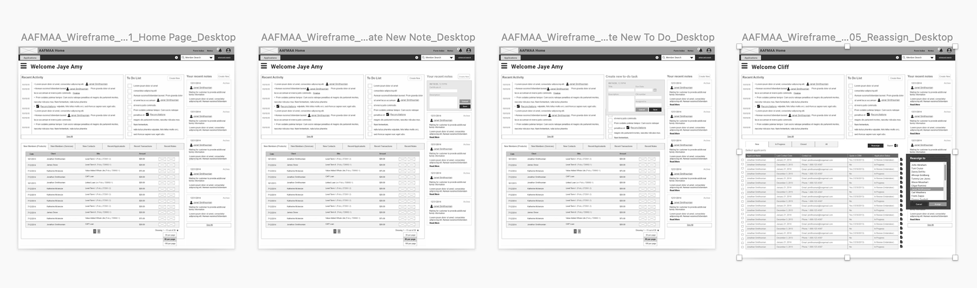
Working closely with their lead developer and project manager, we compiled a requirements document based on our research, site map, and user interviews. Next, I began creating low-fidelity wireframes to reflect the needs based on that document. I created these in batches starting from the main page that held the more general information and worked my way to the more detailed interior pages.
We went through many rounds of wireframe edits before finally approving the layout and userflow. Once I received approval, I began the interface designs. I presented several design concepts all based on AAFMAA's existing brand guidelines. Once a week I would meet with the project manager and lead developer to discuss and tweak designs. Once we were satisfied and narrowed down to three concepts, we presented them to the rest of the committee to deliberate and narrow down the final concept.
Including users in the design process is an important step since they will be the ones using this tool after all. The last thing I would want is for the users themselves to hate looking at the new user center.
Including users in the design process is an important step since they will be the ones using this tool after all. The last thing I would want is for the users themselves to hate looking at the new user center.
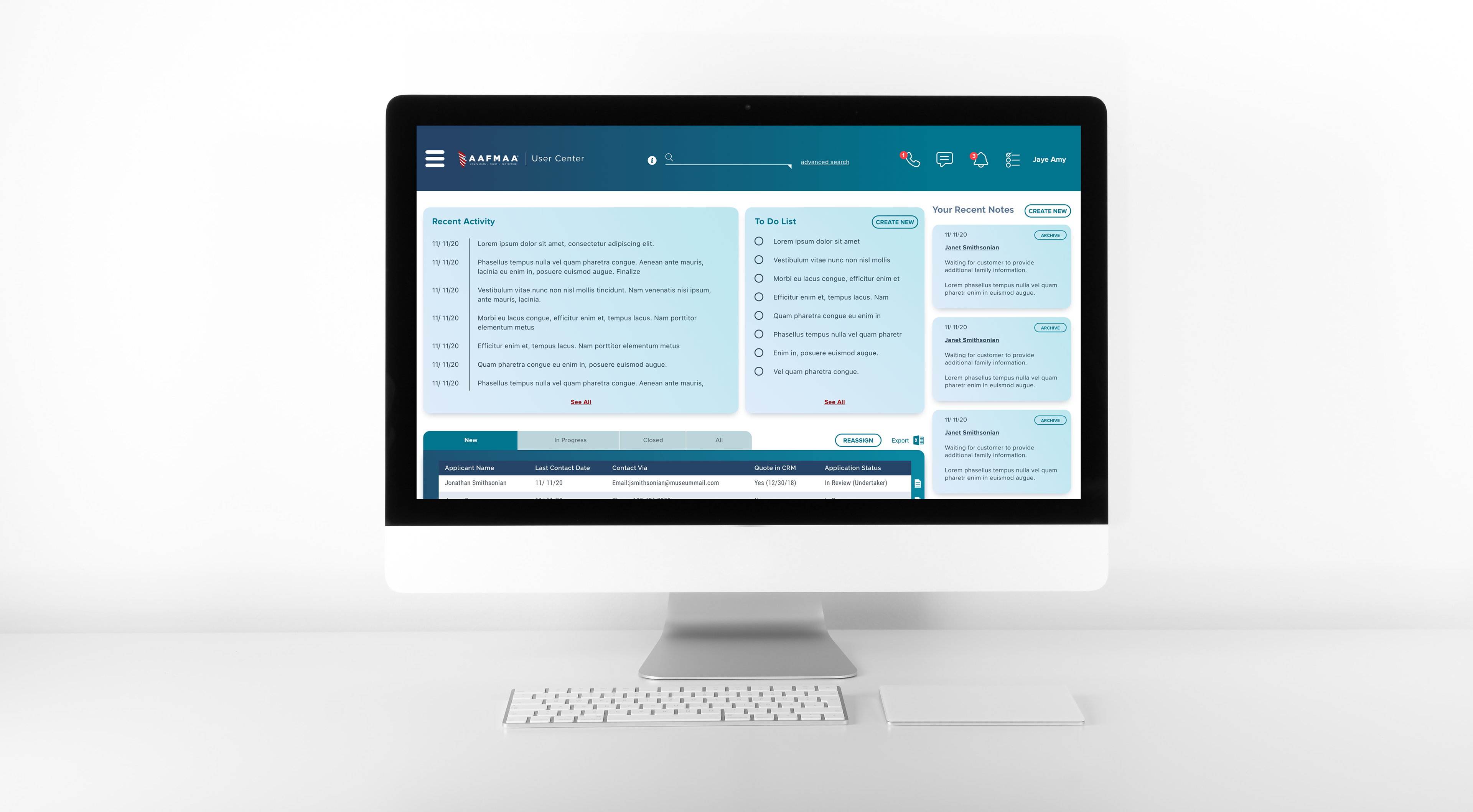
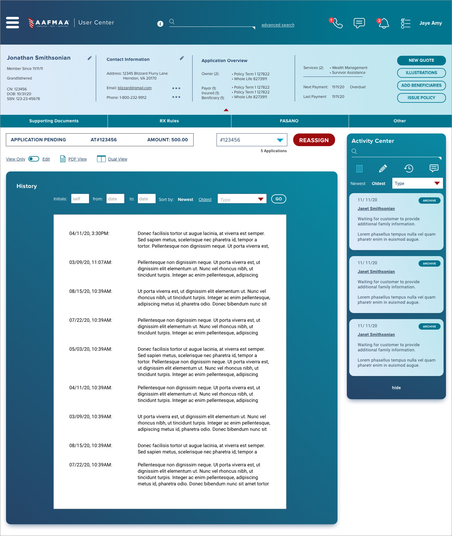
The home page layout consists of cards. This page acts as the user's command center where they can gain a general scope of their tasks.
The top bar consists of a convenient search bar, phone call function, messages, the user's updates notification, and to-do list.
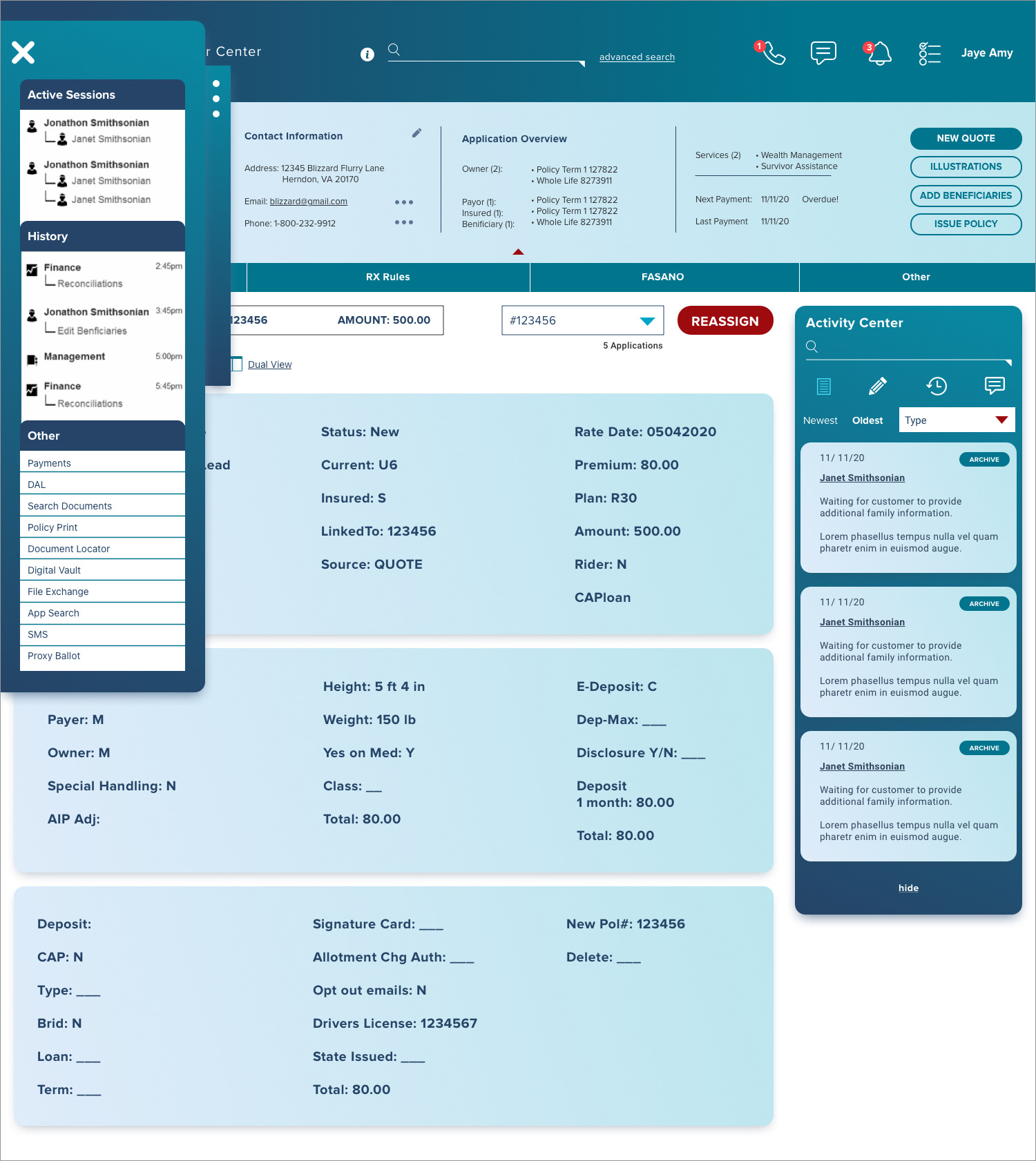
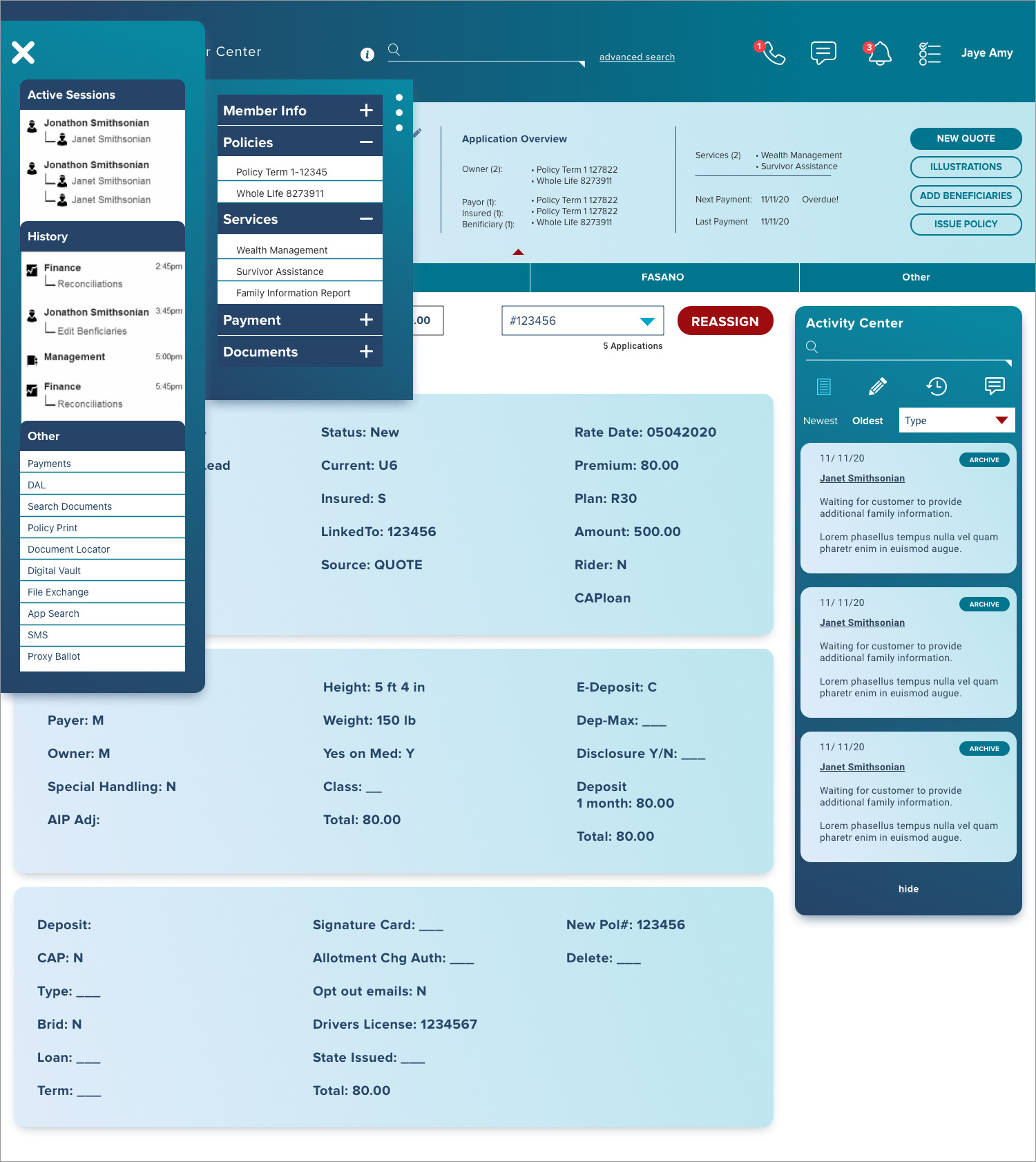
Lesser used menu items reside in the minimal hamburger menu on the top left corner.
The top bar consists of a convenient search bar, phone call function, messages, the user's updates notification, and to-do list.
Lesser used menu items reside in the minimal hamburger menu on the top left corner.
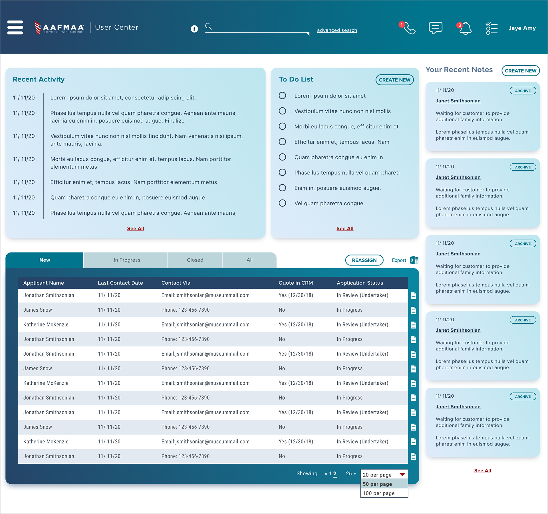
The lists, tasks, and notes are easily editable. One of their frequent actions is reassigning applications so I made sure that they could easily reassign an application to another user with just a few clicks.
Coming from a terminal system that used the tab button to navigate, the ability to click to reassign would be a tremendous upgrade in speed and efficiency.
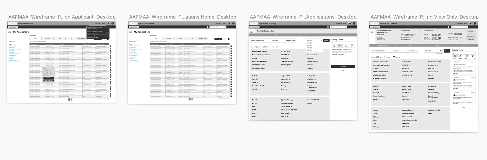
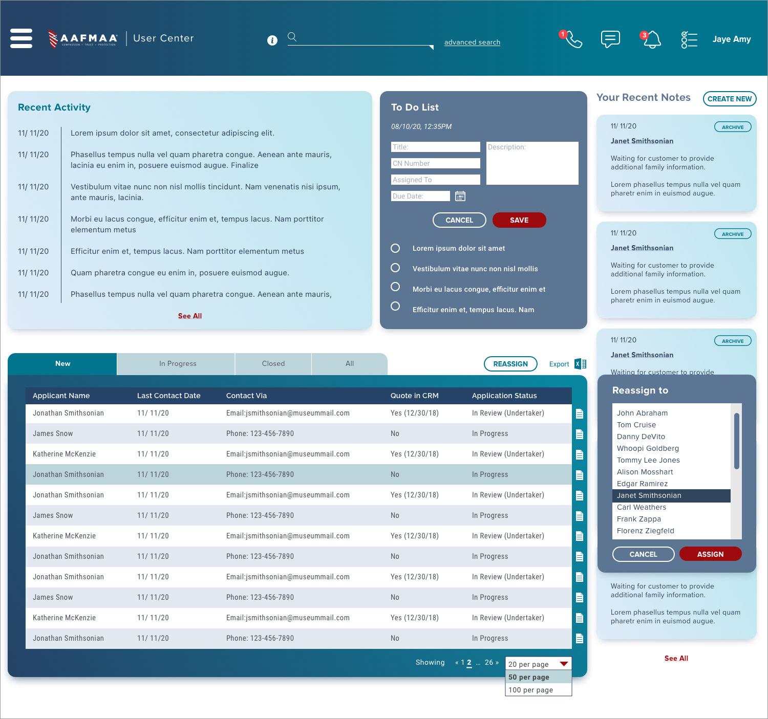
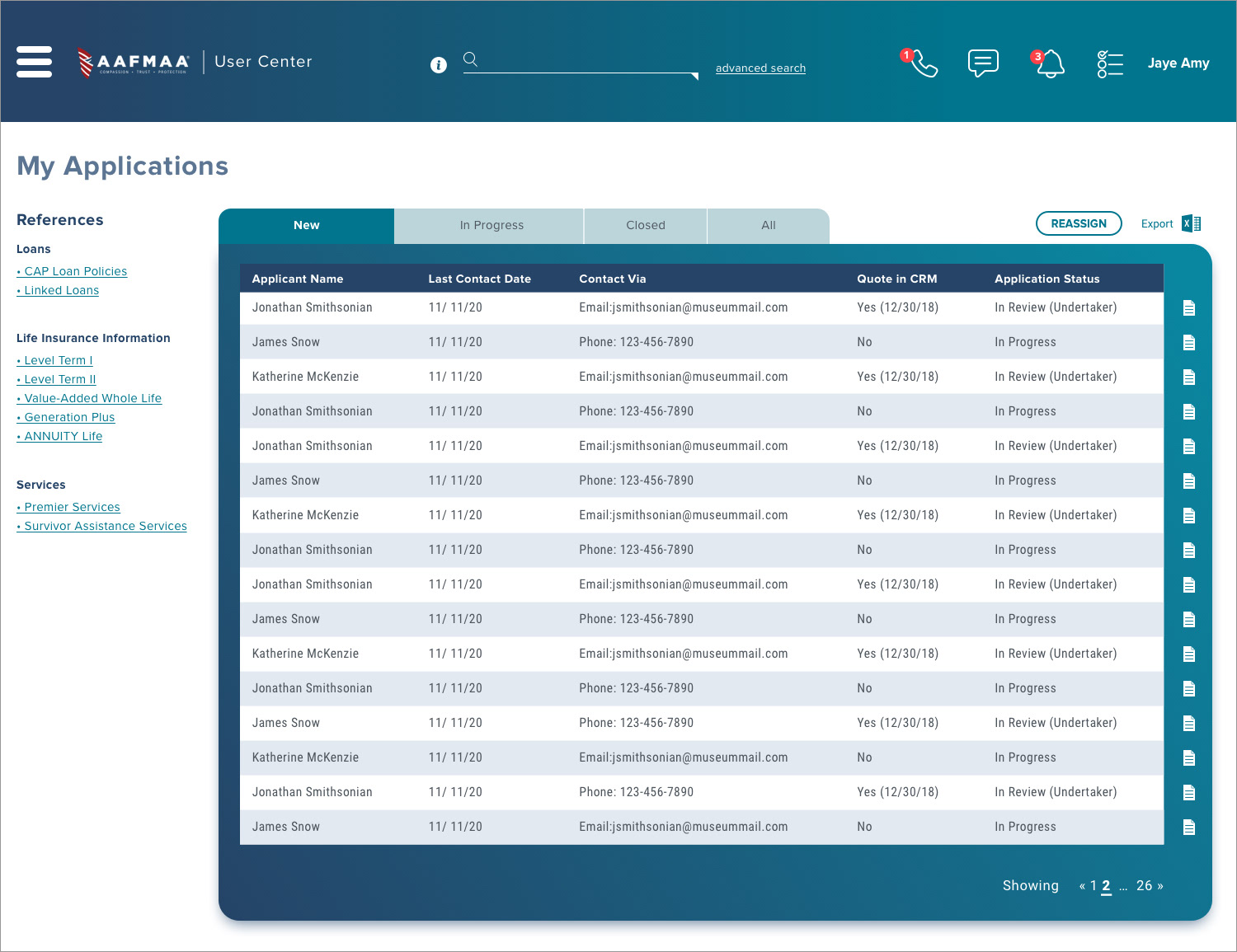
The next page is a full list of all of the user's applications. These can be sorted and viewed in different ways through tabs. An abbreviated version of this list is seen on the dashboard of the main page.
One updated feature allows for callout boxes revealing actions.
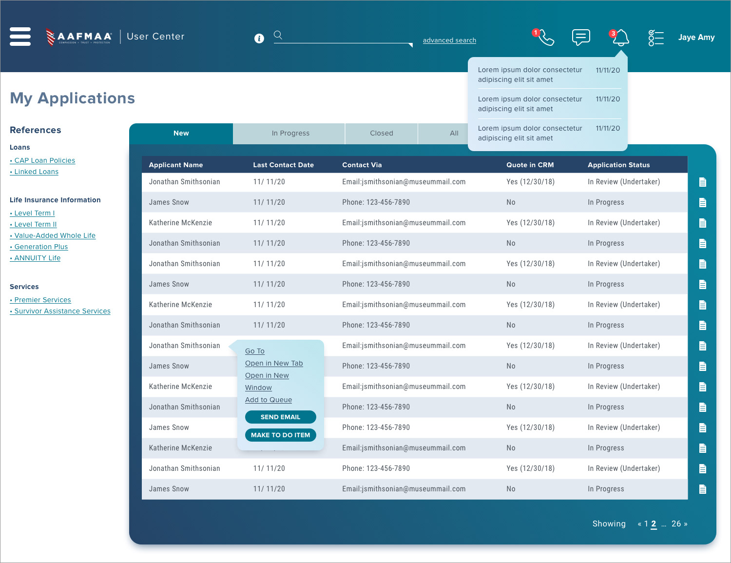
The notifications symbol alerts users of any updates, and clicking on a client's case reveals the different actions that are relevant to the client.
Users can also quickly look up cases with a search bar using CN numbers and member names and personal information.
Another new feature includes a checklist capability so that users can export or reassign multiple applications at once.
Another new feature includes a checklist capability so that users can export or reassign multiple applications at once.

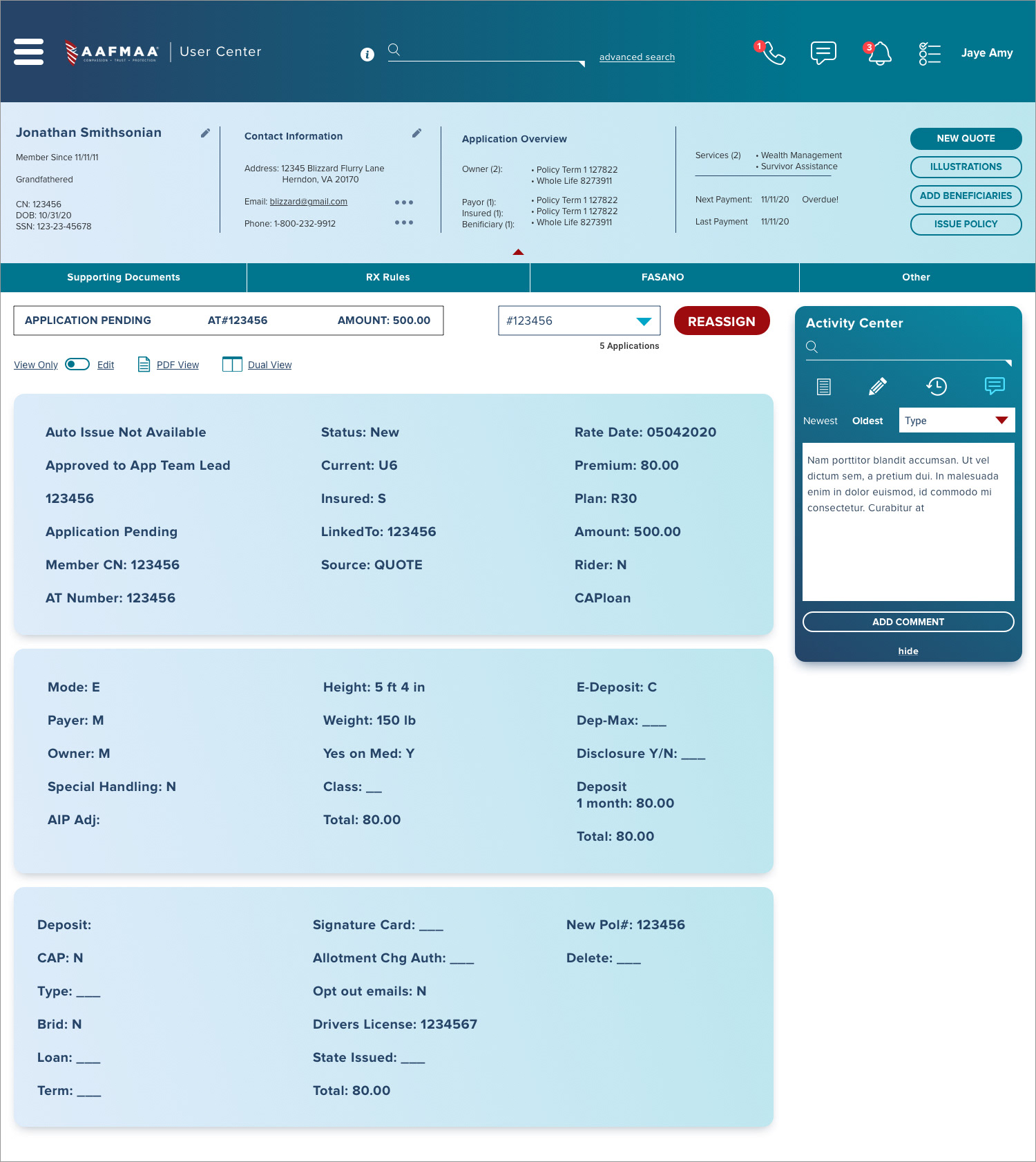
When viewing individual applications, one of the most frequent actions that users made was writing and reading notes so I created an Activity Center sidebar that would allow all of these actions in one place.
The application view also includes a top panel of general member information that the user can expand as needed and collapse once they no require that information.
The application view also includes a top panel of general member information that the user can expand as needed and collapse once they no require that information.
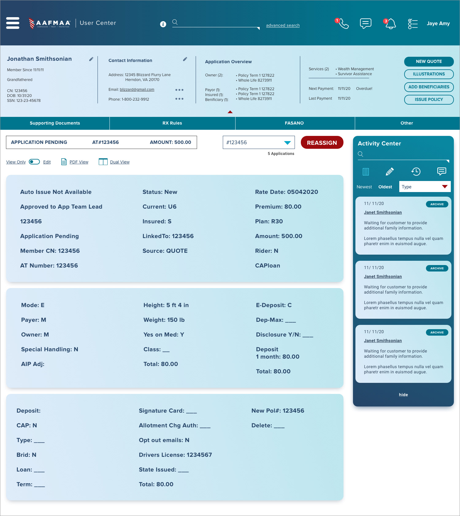
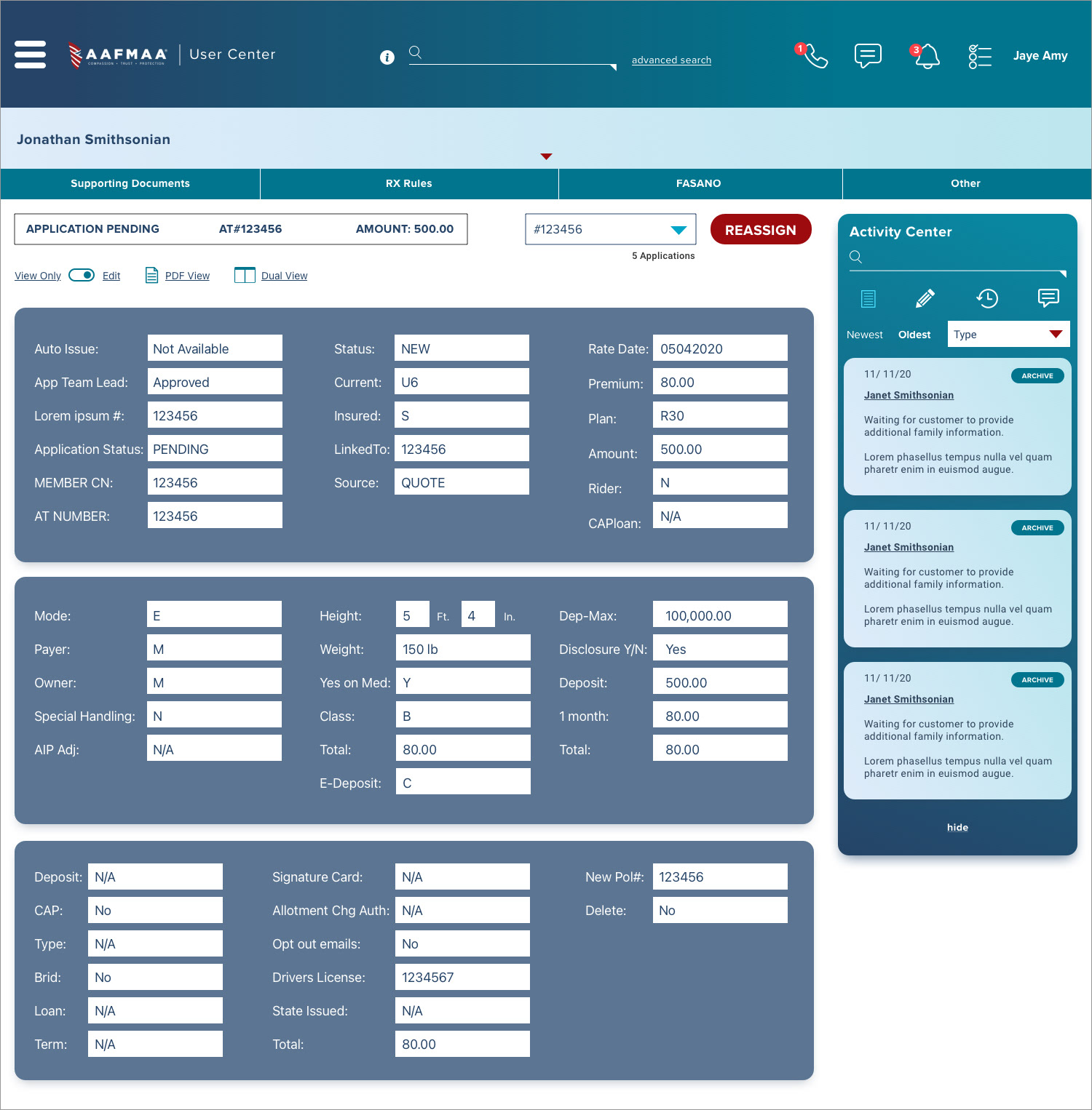
Applications also have a toggle on the left hand side that switches from "View Only" to "Edit." When editing, the application switches to the familiar edit mode with open fields to type in.
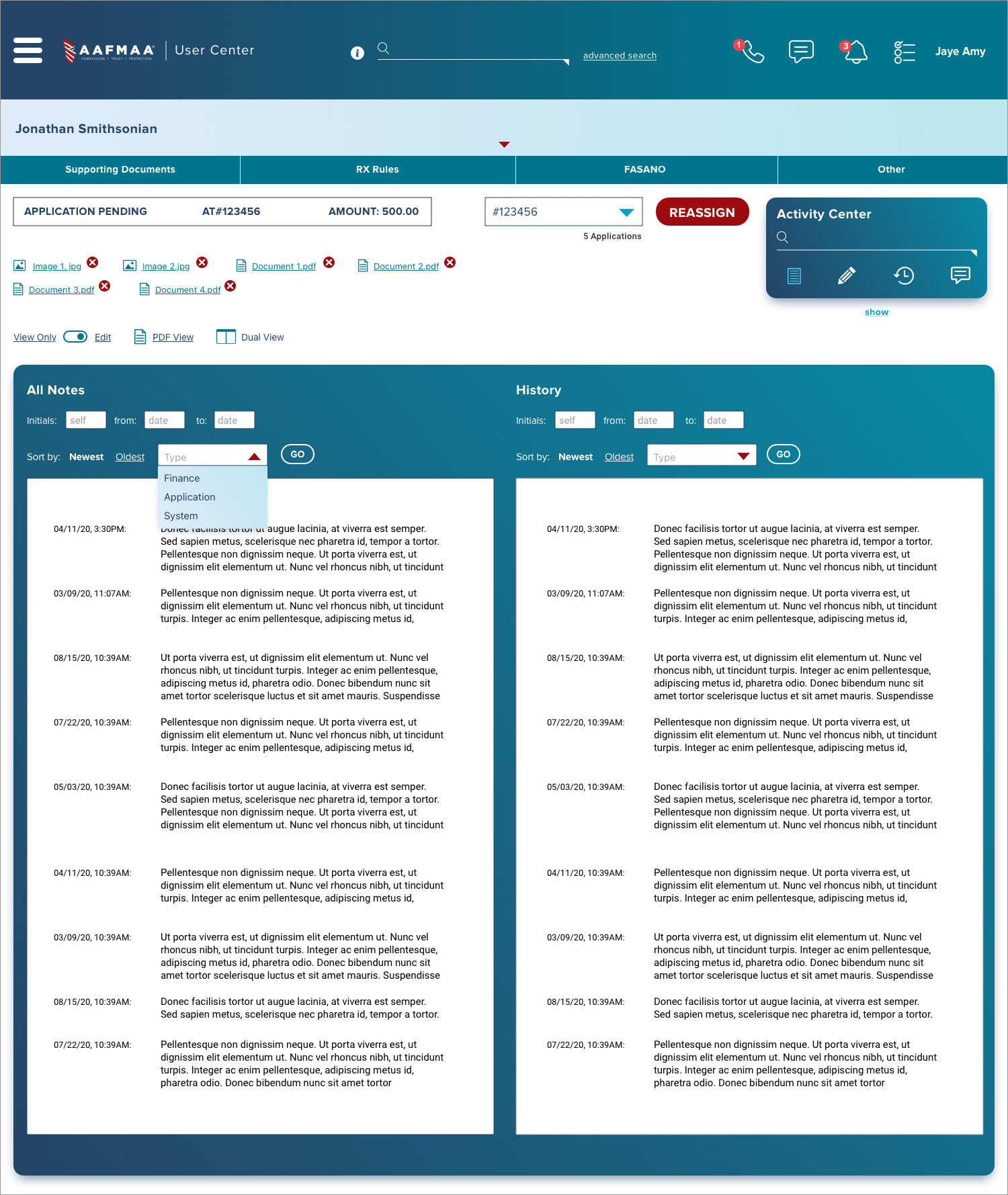
Another key component in user workflow included the ability to compare documents. Every member's application profile includes multiple documents that users often check and cross reference. By clicking "Dual View," the users can open a second document to view side-by-side.
Last but not least, the lower priority action items reside in a nested, collapsible hamburger menu that is neatly tucked away in the upper left corner. I designed their menu this way as the items inside are not used very frequently by users day-to-day. When needed, the information is easily accessed and easily hidden once finished.
The AAFMAA User Center is currently in the development stage with the design stage completed. My client was pleased with the results and final product design as it satisfied their desires for a clean, streamlined, and updated tool. We succeeded in making their jobs more efficient and also more elegant while adhering to the company's brand.