
PROBLEMS
• Boring style
• Lack of new engagement
• Too much content
GOALS:
• Increase voters
• More youthful style
• Fundraise
• Provide resources for members
Working with an art director, project manager, and the client, we mapped out the site's main problems. Identifying the main problems is always the most helpful step in UX design. The worst is always when the client doesn't know what they want to do so we end up floundering and extending deadlines until they can envision their own goal.
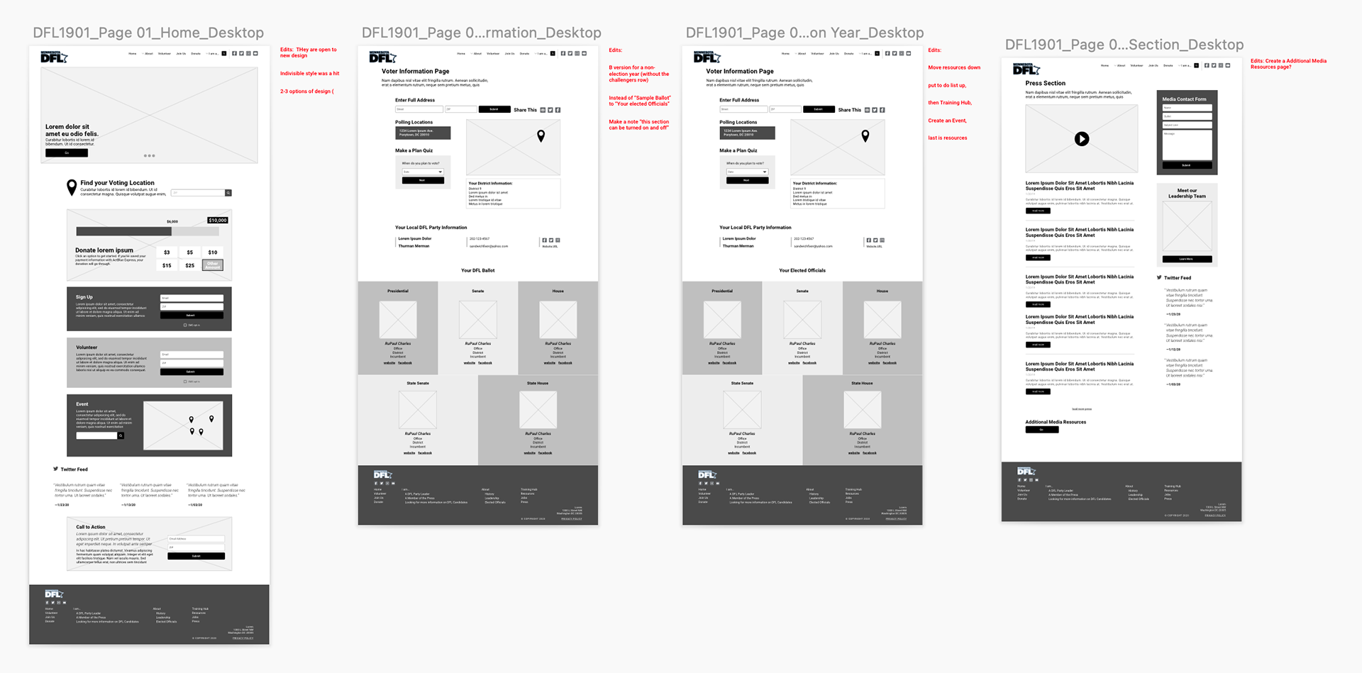
We compiled a document of the site requirements that I eventually used to base my wireframes on. After several rounds of edits and final approval of wireframes by the client as well as my team, I began the fun phase of designing the UI.
We compiled a document of the site requirements that I eventually used to base my wireframes on. After several rounds of edits and final approval of wireframes by the client as well as my team, I began the fun phase of designing the UI.
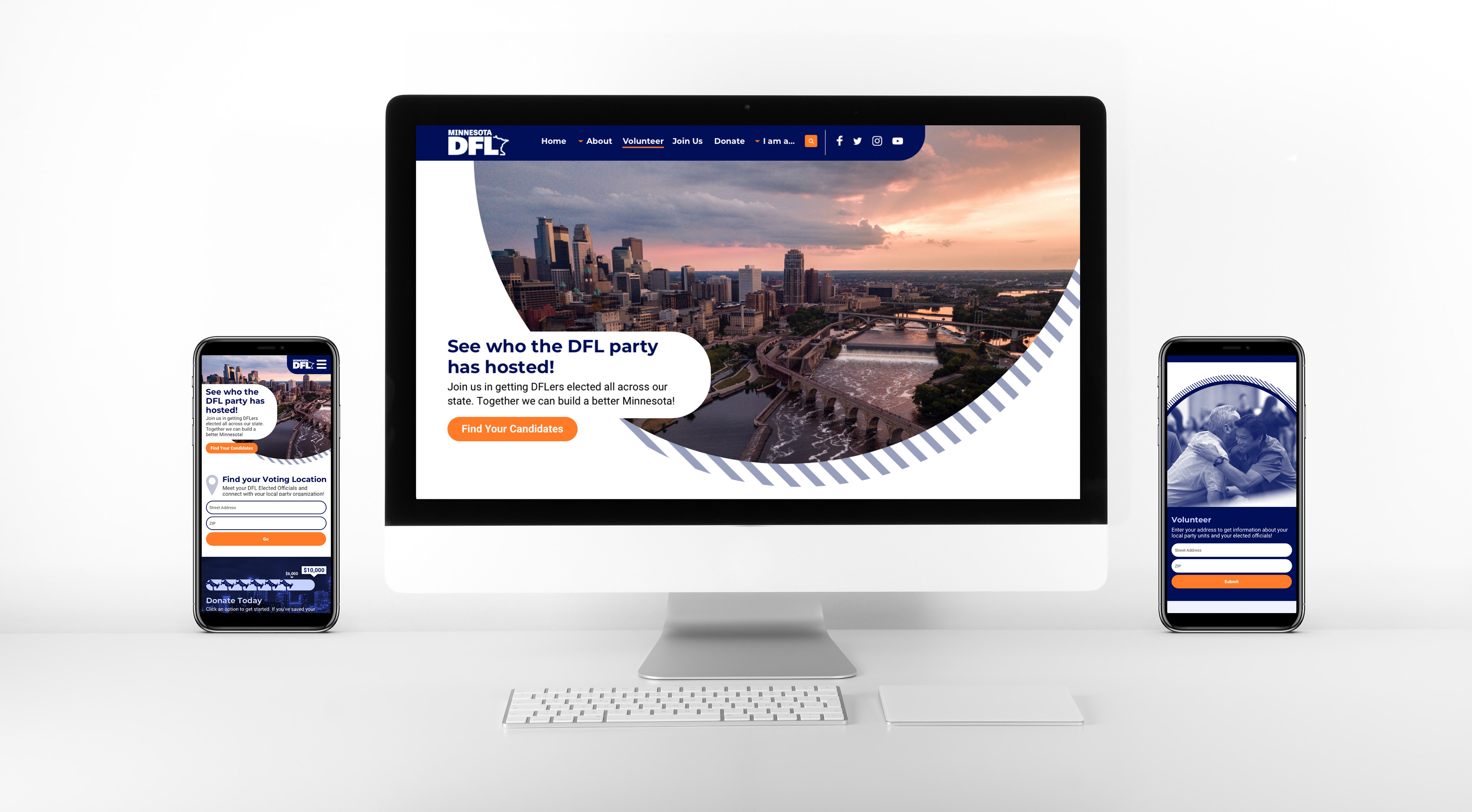
I used high contrast, lively colors, and a striped pattern motif to draw attention and give a playful feel. I also implemented soft curves to the design elements to appear friendly and welcoming.
We wanted the home page to first and foremost showcase their latest news and achievements and also immediately encourage users to donate and find their nearest voting location.
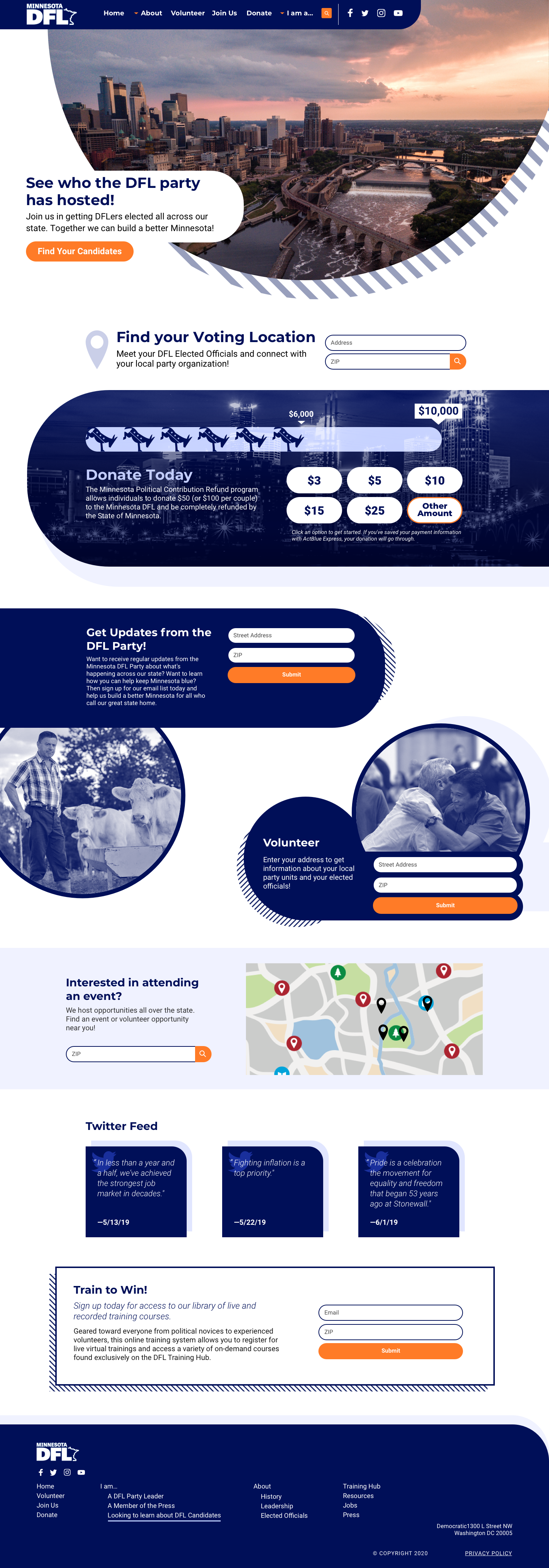
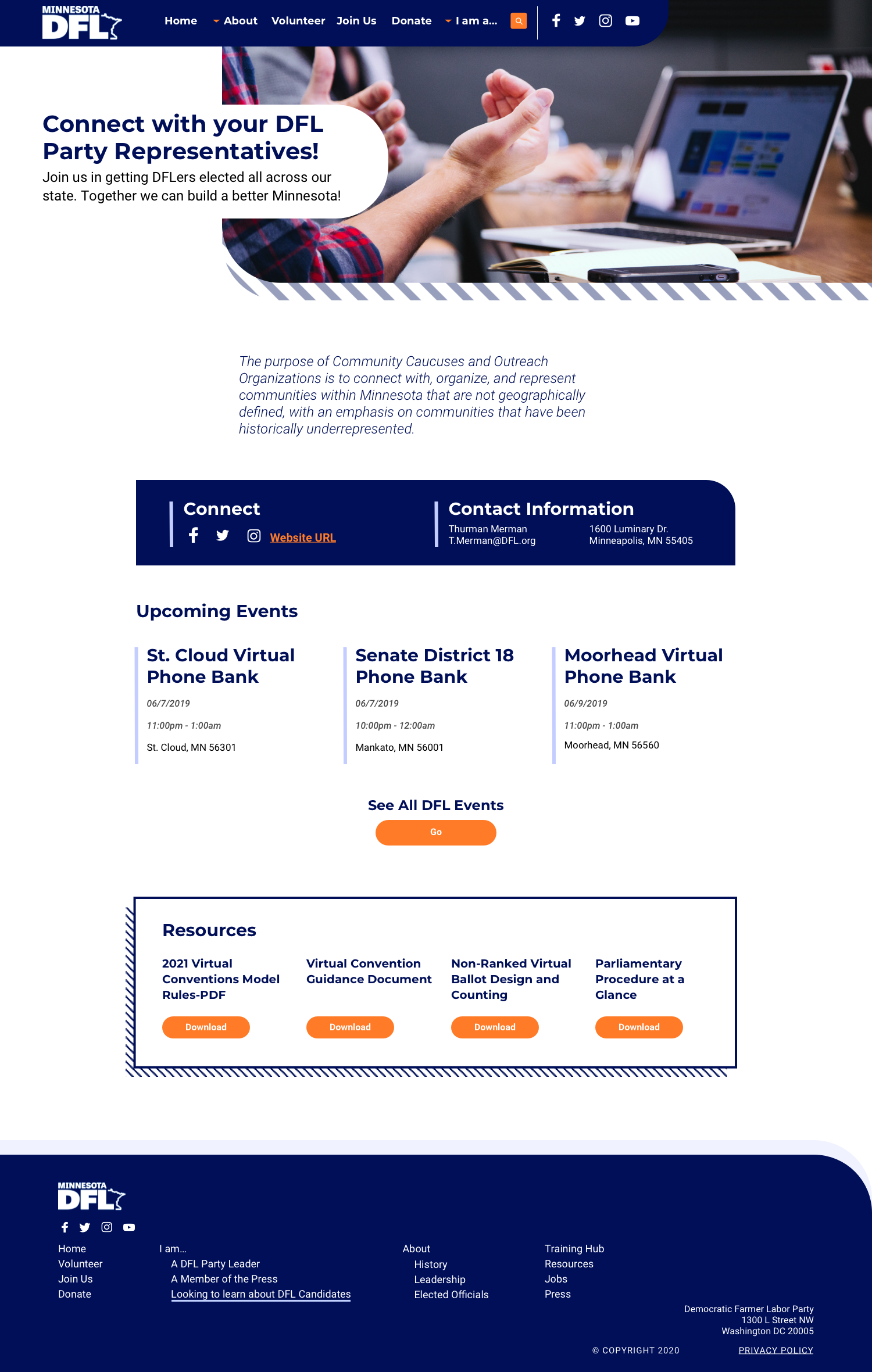
The client's line of work involved many moving parts so we needed to create separate small modules that could be expressed and suppressed as needed. I created a small library of modules for them to use for whatever new content they had in the future.
After several rounds of edits by the client and my team, we received final approval to begin the development stage. Once the developers built the site, we continued to buglist and fine-tune any aspects that did not match the approved designs. Once all bugs were closed, the site finally went live.
Overall, I designed twenty-seven pages for their website as well as mobile designs. The site was well received by the client, and they continue to use it actively today. You may visit at the link below.
Overall, I designed twenty-seven pages for their website as well as mobile designs. The site was well received by the client, and they continue to use it actively today. You may visit at the link below.